Interactive Product Card Using HTML, CSS And JavaScript – Torque Programming
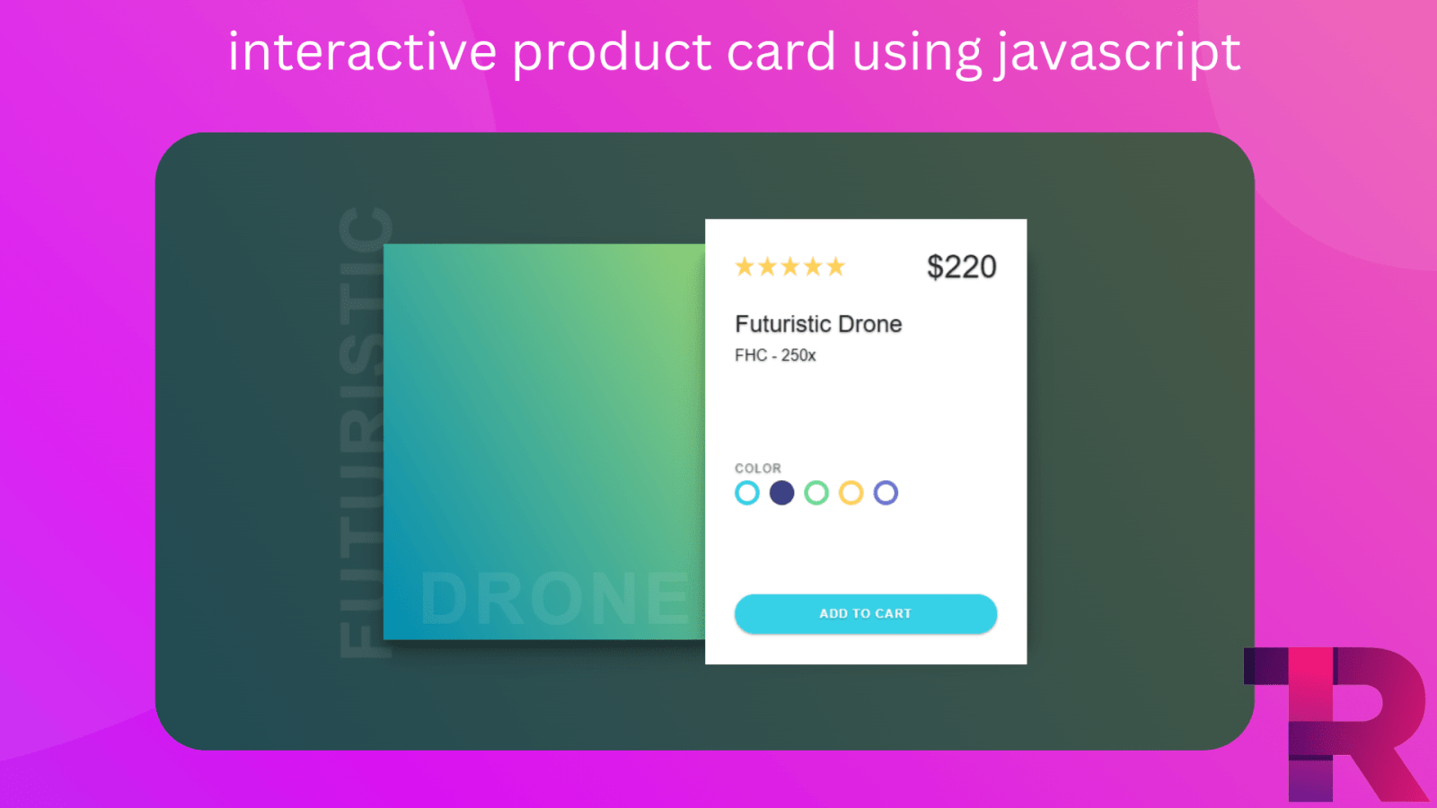
Hi everyone! Welcome to Torque Programming. In this blog, I’ll show you how to create an Interactive Product Card using HTML, CSS and JavaScript. You can use this cool effect on your website or portfolio to showcase your skills or features.
We’ll go through it step-by-step. Let’s begin!
But before we start, I wanted to share some fun JavaScript Code that you might be interested in creating:
Toggle Profile Card Info Using JavaScript
I suggest that you don’t simply copy and paste the code. Instead, try to understand the code by looking at it, and then type it out on your own. This will help you learn better!
Product Card Using HTML, CSS & JavaScript
Starter Template
HTML Code
<!DOCTYPE html>
<html lang="en">
<head>
    <!-- Required meta tags -->
    <meta charset="utf-8">
    <meta name="viewport" content="width=device-width, initial-scale=1">
    <title>Interactive product card - Torque Programming</title>
</head>
<body>
    <!-- Further code here -->
</body>
</html>
Paste the below code in your <body> tag
<div class="card" id="card">
    <!--  -->
    <h2 class="title">FUTURISTIC</h2>
    <div class="card__img">
        <div class="scene"></div>
        <h2 class="subtitle">DRONE</h2>
    </div>
    <!--  -->
    <div class="card__description">

        <div class="card__container">
            <!--  -->
            <div class="card__info">
                <div class="card__header">
                    <div class="card__rating">
                        <svg height="25" width="23" class="star rating" data-rating="1">
                            <polygon points="9.9, 1.1, 3.3, 21.78, 19.8, 8.58, 0, 8.58, 16.5, 21.78" />
                        </svg>
                        <svg height="25" width="23" class="star rating" data-rating="1">
                            <polygon points="9.9, 1.1, 3.3, 21.78, 19.8, 8.58, 0, 8.58, 16.5, 21.78" />
                        </svg>
                        <svg height="25" width="23" class="star rating" data-rating="1">
                            <polygon points="9.9, 1.1, 3.3, 21.78, 19.8, 8.58, 0, 8.58, 16.5, 21.78" />
                        </svg>
                        <svg height="25" width="23" class="star rating" data-rating="1">
                            <polygon points="9.9, 1.1, 3.3, 21.78, 19.8, 8.58, 0, 8.58, 16.5, 21.78" />
                        </svg>
                        <svg height="25" width="23" class="star rating" data-rating="1">
                            <polygon points="9.9, 1.1, 3.3, 21.78, 19.8, 8.58, 0, 8.58, 16.5, 21.78" />
                        </svg>
                    </div>
                    <p class="card__price">$220</p>
                </div>
                <h1 class="card__title">Futuristic Drone</h1>
                <h2 class="card__subtitle">FHC - 250x</h2>
            </div>
            <!--  -->
            <div class="colors">
                <span class="color__title">COLOR</span>
                <div class="color__container">
                    <div class="color__item"></div>
                    <div class="color__item"></div>
                    <div class="color__item"></div>
                    <div class="color__item"></div>
                    <div class="color__item"></div>
                </div>
            </div>
            <!--  -->
            <a class="card__button">ADD TO CART</a>
        </div>
    </div>
</div>
Output Till Now

CSS Code
*,
*::after,
*::before {
    margin: 0;
    padding: 0;
    box-sizing: border-box;
}

/************/
html,
body {
    display: flex;
    justify-content: center;
    align-items: center;
    width: 100%;
    height: 100%;
    min-width: 650px;
    min-height: 500px;

    font-size: 11px;
    font-family: 'Montserrat', sans-serif;
    text-shadow: 0 1px 2px rgba(0, 0, 0, 0.12), 0 1px 2px rgba(0, 0, 0, 0.24);
    background-image: linear-gradient(-120deg, #4B5A45, #1E4954);
    color: #232323;
    user-select: none;
}

ul {
    list-style: none;
}

svg {
    fill: #ffd055
}

/************/
.card {
    display: flex;
    position: relative;
    width: 650px;
    height: 400px;
    transform-style: preserve-3d;
    transition: .5s ease;

    @media(max-width: 1000px) {
        transform: scale(.8);
    }

    @media(max-width: 800px) {
        transform: scale(.6);
    }

    @media(max-width: 600px) {
        transform: scale(.5);
    }

}

/**/
.card__img {
    position: relative;
    width: 325px;
    height: 100%;
    background-image: linear-gradient(-120deg, #91D277, #008CB3);
    box-shadow: 0 14px 28px rgba(0, 0, 0, 0.25), 0 10px 10px rgba(0, 0, 0, 0.22);
}

.scene {
    position: absolute;
    top: 35px;
    left: -25px;
    width: 350px;
    min-height: 325px;
    z-index: 10;
}

.title,
.subtitle {
    position: absolute;
    color: #ffffff;
    font-size: 72px;
    opacity: .075;
    letter-spacing: 4px;
    font-weight: bolder;
}

.title {
    transform: rotateZ(-90deg) translateX(-73%) translateY(30%);
    transform-origin: bottom left;
}

.subtitle {
    bottom: 0;
    right: 10px;
}

/**/
.card__description {
    position: absolute;
    top: 0;
    right: 0;
    width: 325px;
    height: 100%;
    box-shadow: 0 14px 28px rgba(0, 0, 0, 0.25), 0 10px 10px rgba(0, 0, 0, 0.22);
}

.card__container {
    display: flex;
    flex-direction: column;
    justify-content: space-between;
    position: relative;
    top: -25px;
    width: 100%;
    height: 450px;
    padding: 30px;
    background-color: #ffffff;
}

.card__header {
    display: flex;
    justify-content: space-between;
    align-items: center;
    margin-bottom: 20px;
}

.card__rating {
    display: flex;
}

.card__price {
    width: 100%;
    font-size: 32px;
    text-align: right;
}

.card__title,
.card__subtitle {
    font-size: 24px;
    font-weight: 400;
    line-height: 1.6;
}

.card__subtitle {
    font-size: 16px;
}

.card__button {
    display: flex;
    justify-content: center;
    align-items: center;
    height: 40px;
    width: 100%;

    font-size: 12px;
    font-weight: bolder;
    letter-spacing: 1px;
    border-radius: 35px;
    color: #ffffff;
    background-color: #36D1E7;
    box-shadow: 0 1px 3px rgba(0, 0, 0, 0.12), 0 1px 2px rgba(0, 0, 0, 0.24);
    cursor: pointer;
}

.card__button,
.card__info,
.colors {
    transform: translateZ(35px);
}

/**/
.colors {
    display: flex;
    flex-direction: column;
    width: 100%;
}

.color__title {
    line-height: 2;
    font-size: 12px;
    color: #868686;
    letter-spacing: 1px;
}

.color__container {
    display: flex;
}

.color__item {
    height: 25px;
    width: 25px;
    margin-right: 10px;
    border-radius: 50%;
    background-color: #fff;
}

.color__item:nth-of-type(1) {
    border: 4px solid #36D1E7;
}

.color__item:nth-of-type(2) {
    background-color: #394282;
}

.color__item:nth-of-type(3) {
    border: 4px solid #6BDA94;
}

.color__item:nth-of-type(4) {
    border: 4px solid #FBCB61;
}

.color__item:nth-of-type(5) {
    border: 4px solid #6A73CF;
}
Final Output